A Beginner’s Guide to Wordmark Logo Design

Although many companies use symbols in their logo design, it’s not a necessity. You can create a perfectly unique and memorable logo using just one typeface. This is called a Wordmark logo. To create a successful Wordmark logo, you need to have a basic knowledge of typography and how typography can be used to show your business’ personality.
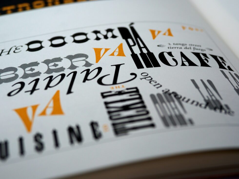
Photo by Brett Jordan
Typefaces can be like artwork, in the sense that your favourite font will be another person’s least favourite font. Fonts can give words personalities that are generally universally recognised. A good example of this is the almost universally hated font Comic Sans. Although very readable, it just rubs people the wrong way. The main aim of a good typeface should be to subliminally represent a feeling, without the typeface being scrutinised itself too carefully. The font used in the London Underground, Gill Sans, is universally recognised in the UK as the font used in the London Underground – even if people don’t know its name. Designers, however, would describe Gill Sans as a classic, solid, British modernist typeface with lots of authority.
The results of a Font Census made by Type Tasting revealed the most commonly highlighted personalities of a few of the most famous fonts. A few examples include:
- Didot: Intellectual, traditional & important
- Bodoni Poster: Performer, confident & dramatic
- Caslon: Academic, traditional & knowledgeable
- Times New Roman: Intellectual, confident & neutral
- Garamond Italic: Artist, confident & classic
- Friz Quadrata: Leder, confident & classic
Further to personalities, some fonts have even become synonymous with locations! Such as Fraktur with Germany, Caslon with the UK and Bodoni with Italy.
But rather than overthink into specific font personalities, there are a few things to look out for in a typeface to place it on a spectrum between friendly and professional. A more friendly typeface (Serif OR Sans Serif) might have more rounded terminals (the ends of letters, like the corner bits!) and will generally feature single-storey letterforms (e.g. Frankfurter). Whereas a more professional typeface will have a more moderate weight, appear straighter and may feature double-story letterforms (e.g. Serif: Times New Roman, Sans Serif: Helvetica). However, like I said earlier, typefaces are like art and you’ll know what you like or what you feel reflects your personality. You can also ask a really cool designer like me to help you find one.
I would suggest finding a list of at least 10 typefaces that you love – experiment, choose more than one style, look at Serifs and San Serifs, Grotesks, Egyptian, anything and everything! Because from this point on you’ll want to compare different styles for usability. You may find a font you loved on Google Fonts looks absolutely awful when it’s in your brand colour and in Logo position on your website!
But before usability testing, it’s time to play around with your chosen typefaces. Would you prefer your characters closer together or further apart (this is called tracking!)? Inline or typed in a shape form? One colour or a few? Multiple point sizes? Then if so is your leading correct (the space between lines vertically)? Perhaps you love two different fonts and there’s a way you can merge them together, this will take a little more design skill to manipulate letterforms, but it’s all possible.
Once you’ve got a few options for your logo it’s time for you to test its usability. This includes testing how it looks at different sizes, is it still recognisable and legible? This is incredibly important. If it’s not, is it possible to tweak it so that it can be? The other usability colour has to do with colour. You can use online tools to test how accessible certain colours will be over each other, again this is incredibly important, you need your whole brand to be accessible.
The last step once you’re happy with your design, is user testing. You don’t need everyone to love it, but if there’s a legibility or accessibility issue you haven’t discovered, it’s better to find out now from a group of reviewers than later from potential clients.
At each stage of this process you may have to loop back to a previous step or even the beginning. But at the end of the day, if you create a Wordmark logo that is accessible, legible and that reflects you and your business – you should be very excited launching your brand.