Responsive Design in the Era of Large Screen Devices: A New Canvas

In today’s digital age, screen sizes span from smartwatches to large 4K desktop monitors and even bigger smart TVs. Responsive web design has never been more essential. As screen sizes continue to grow, the playbook for responsive design is evolving. Let’s take a deeper look at some of the modern strategies for responsive design, with a special focus on the potential of container queries and the creative opportunities presented by large screen devices.
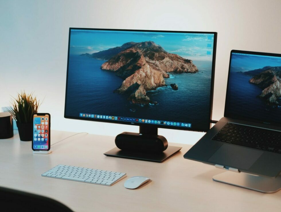
Photo by Linus Mimietz
The Status Quo: Media Queries
Traditionally, media queries have been the cornerstone of responsive design, offering the ability to apply different CSS rules for different screen sizes. They’ve served us well, but in an era of modular, component-based design, they have their limits.
/* Media Query Example */
@media (min-width: 768px) {
  .container {
    width: 80%;
  }
}
The Future: Container Queries
Container queries promise a paradigm shift in how we think about responsive design. Unlike media queries, which look at the viewport size, container queries consider the size of the parent container.
The Potential of Container Queries
Here’s why container queries could be a game-changer:
- Component-Level Control: Each component adapts individually to its parent container.
- Tailored Experiences: No more compromises due to viewport sizes; each container can have its unique set of rules.
/* Container Query Example */

.parent-element {
  container-type: inline-size;
}

@container (width > 400px) {

  .child-element {
    /* Your CSS rules here */
  }
}
Creative Freedom on a Larger Canvas
When you combine the control offered by container queries with the expansive real estate of large screens, you open the door to some truly immersive experiences. Here are some ways to harness that potential:
- Dynamic Storytelling: More space means you can create rich, engaging stories with multiple media types (text, images, video).
- Interactive Dashboards: Use the space to display real-time data in a visually compelling way, without overwhelming the user.
- Artistic Layouts: Leverage the canvas to push the boundaries of web design, experimenting with asymmetrical layouts, complex grids, or even interactive 3D elements.
The Nitty-Gritty: Best Practices and Tools
- Embrace Mobile-First: Start small and scale upwards. It’s easier to add complexity than to simplify an overly complex design.
- Progressive Enhancement: Use modern CSS like Flexbox and Grid to enable richer layouts as screen sizes grow.
- Real-world Testing: Tools and emulators have limitations. Test on actual devices, especially when targeting less common, larger formats.
- Pioneer with Container Queries: Start incorporating container queries to discover new creative possibilities.
The Future: Container Queries and Compatibility
Container queries promise a paradigm shift in how we think about responsive design. Unlike media queries, which look at the viewport size, container queries adapt to the size of a parent container. This opens up possibilities for modular design like never before.
/* Container Query Example */

.parent-element {
  container-type: inline-size;
}

.child-element {
  /* Your CSS rules here */
}

@container (width > 400px) {

  .child-element {
    /* Your CSS rules here */
  }
}
However, container queries are still an emerging technology. While exciting, they’re not yet fully supported across all browsers. Before jumping in, it’s a good idea to consult compatibility tables such as those found on Can I Use to gauge whether they’re a fit for your project.
Fallback Strategies
If you do decide to go ahead with container queries, you’ll need to implement fallbacks to ensure compatibility with older or less advanced browsers.
/* Fallback for Older Browsers */
.child {
  background: lightgray; /* Default */
}
/* Container Query */
.container[min-width~="300px"] .child {
  background: lightgreen;
}
Creative Possibilities with Larger Screens
With more screen real estate than ever before, designers and developers have a new canvas for creative expression. Container queries add another tool to the toolkit, allowing for even more precise design elements that can adapt not just to the screen size, but to their parent containers as well.
In Summary
Responsive design is not just about fitting your content onto different screens; it’s about creating optimal user experiences regardless of the device. With large screen devices becoming more prevalent, and container query technology maturing, we are entering an exciting era offering greater creative freedom and more control than ever before. Let’s leverage these new tools and opportunities to push the boundaries of what’s possible on the web.