Colour Psychology in Branding
Why You Shouldn’t Trust the Rainbow
Colour psychology has long been touted as a powerful tool for marketers looking to create a strong brand identity. But while it’s true that colour can have a powerful impact on our emotions and perceptions, the truth is that the psychology of colour isn’t always as straightforward as it seems. In this article, we’ll take a humorous look at some of the myths and misconceptions surrounding colour psychology in branding.
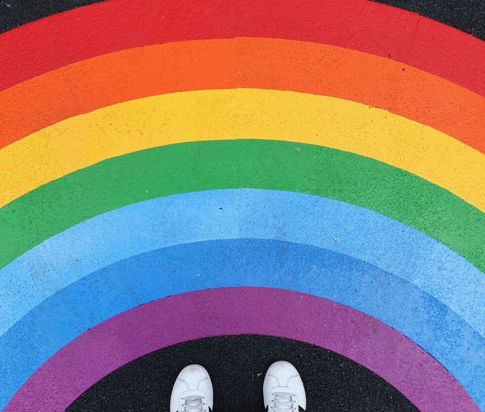
Photo by Carlos de Toro @carlosdetoro on Unsplash
Colour Psychology in Branding
We’ve all heard the spiel about colour psychology in branding. Blue is trustworthy, red is exciting, and green is calming. But is it really that simple? As it turns out, not so much. While there is some truth to the idea that colour can impact our emotions and perceptions, the reality is that the psychology of colour is a lot more complicated than just throwing some blue and green on your logo and calling it a day. So let’s dig a little deeper and separate fact from fiction.
The Myths of Color Psychology:
Myth #1: Blue is always trustworthy.
Blue can be an excellent choice for a trustworthy brand – think banks and insurance companies. But that doesn’t mean it’s the only option. After all, blue can also be associated with sadness and depression. So before you slap some blue on your logo, ask yourself if it makes sense for your brand.
Myth #2: Red always means excitement
Red is often associated with excitement and passion, but it can also be associated with danger and warning. So if you’re using red in your branding, ensure it sends the right message. Remember, colour + context = outcome. It’s not very good for you, but we don’t all think of danger when we see the Coca-Cola branding.
Myth #3: Green is always calming.
Yes, green can be associated with nature and tranquillity, but it can also be associated with envy and greed. So if you’re going for a calming vibe, make sure you’re using the right shades of green.
The Truth About Color Psychology:
So if the psychology of colour isn’t as simple as we once thought, what’s the truth? The truth is that colour can impact our emotions and perceptions, but it’s not the be-all and end-all of branding. Here are a few things to keep in mind:
- Context matters: How colour is perceived can vary depending on cultural and social contexts.
- Brand personality matters: Your brand’s personality should inform your colour choices, not the other way around.
- Differentiation matters: It’s essential to stand out from the competition, so don’t be afraid to break the rules and choose an unexpected colour.
So there you have it – the truth about colour psychology in branding. While colour can undoubtedly play a role in creating a solid brand identity, it’s not the only factor to consider. So the next time someone tells you you must use blue to be trustworthy or red to be exciting, remember – it’s not always that simple. And hey, if all else fails, go for the rainbow – because who doesn’t love a good rainbow?