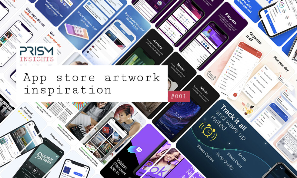
iPhone App Store artwork inspiration | #001.

App Store artwork is a crucial component to making an iPhone app successful. Here are some good examples to spark your creativity.
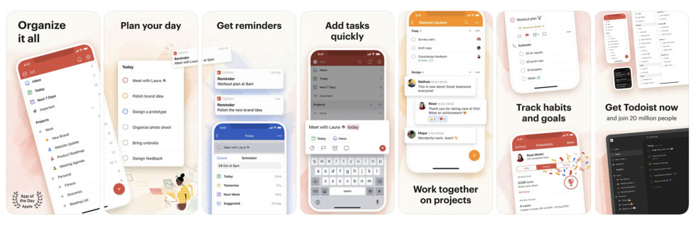
Todoist
Todoist have really brought out the animated feel to their app, making productivity feel a bit more playful and fun. The pop outs in the graphics give it that animated effect too which draws you to their key features. The look and feel is consistent, clean and simple which is key for any planning and organisation app.
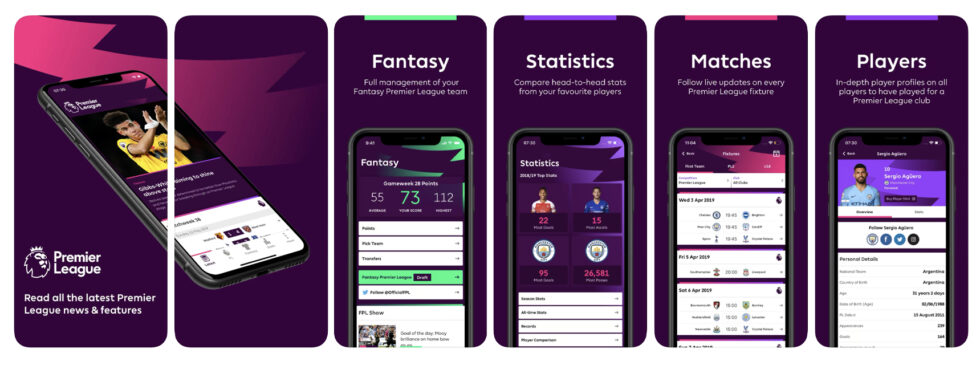
Premier League
Premier League have kept the same layout consistent on each feature screen but with different colours to differentiate the key areas of the app. The four main elements of the app are clear, especially from the use of screenshots of the app itself. The mobile split across the first two screens with the branded streak in the background is really captivating too. A great example of ‘simplicity is key’!
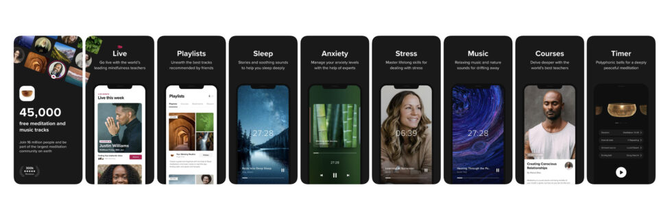
Insight Timer – Meditation App
The app’s dark solid background contrasts really well with the white caption text to make the features stand out a lot. At a glance you can read exactly what the app covers and includes with simple screenshots of the relevant screens. The dark background also emphasises the colours within their app, making the focus on the app itself rather than any fancy background artwork, which really wouldn’t work in this case.
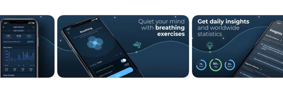
Sleepzy
Sleepzy’s visuals not only make you feel super relaxed just by looking at them, they communicate the app’s main purpose of quieting your mind with exercises at a glance – getting straight to the main reason for downloading the app. The dark theme behind the phone screenshots keeps the graphics looking clean and subtle whilst bringing their brand to life. They’ve kept the screenshots of the app basic but this simplicity works really well for the type of audience who will be looking to use the app.
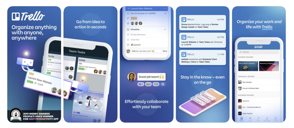
Trello
Trello have played around with different styles in their artwork and not only used mobile mockups, but also used splash screens to demonstrate their features which look a bit more like adverts. This sort of approach keeps the artwork engaging and makes Trello stand out from the crowd of apps on the app store that just use the typical screenshots of the app on a mobile. Trello’s messaging is great too, particularly on their first screen which is the most important. Straight away you know that if you have something to organise, whether business of personal, this is the app for you. They have also showcased specific features which pop out on the screen which is very clever for highlighting the main areas of the app they want you to focus on, whilst still wanting to show the rest of the app too.
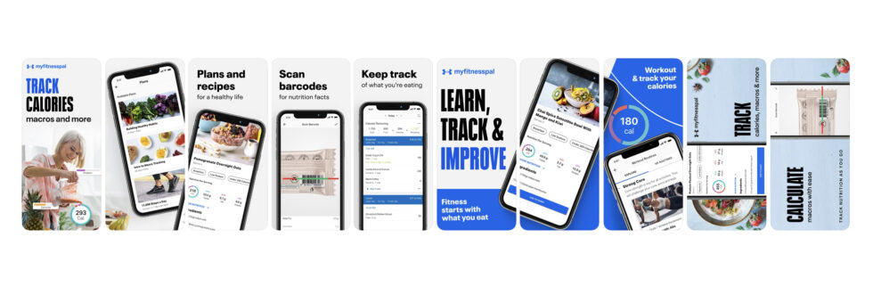
MyFitnessPal
The very first screenshot in the app store is key, and MyFitnessPal is a great example of doing this really well. In their first screenshot the essence and core features of the app is portrayed straight away and the rest of the screens are consistent and clean with the brand. In just a few screens, you know pretty much everything you need to know about the app and its functionality.
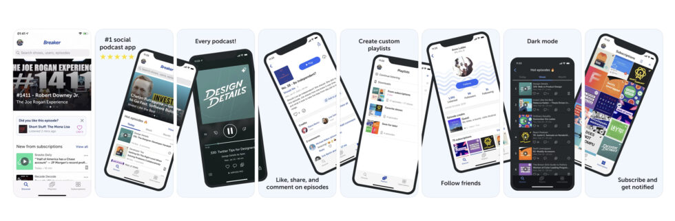
Breaker – Social Podcast App
Using connected artwork screens are not always easy to get right. We’ve seem them a lot and they can get a bit messy and confusing, but when you get it right they can be really engaging and eye-catching. This podcast app does it brilliantly! Their connected screens work really well together, particularly well as there are so many connected screens, but it doesn’t feel to complicated at all. Each screen connects nicely and you can easily see the main features at a glance with their short caption headings too.
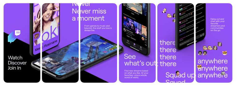
Twitch
At a glance, Twitch’s artwork is very bright and bold which is an instant attraction and the weird messages and random emojis captures the target audience well, but it’s also actually quite clever. As you look at the detail of their artwork, they’ve gone down the route of using familiarity to their advantage. They’ve used an image of a well known Twitch streamer and screenshots of Fortnite which lets be honest, everyone has heard of. So If your brand is well-known for something, use it to your advantage!
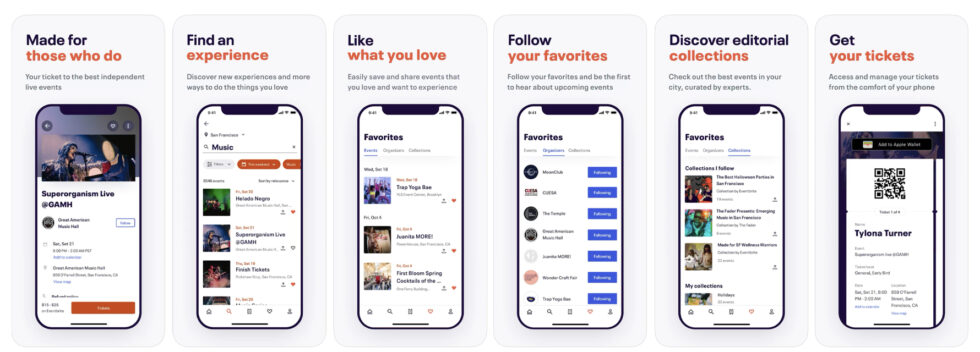
Eventbrite
Eventbrite is a great example of using exact screenshots to show an app in action. This real life scenario style clearly communicates exactly what users can do with the app in just a few screens. With the bold branded headers too, users can see in just a few seconds that they can find, like, follow and purchase experiences and tickets through the app. Sometimes there’s no need for crazy colourful branding when the app and features can sell itself!
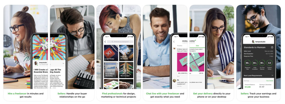
Fiverr
It’s all about knowing your audience and Fiverr certainly nail this through using photography of the type of people that use their app. If you want your audience to download your app, the visuals need to resonate! The alternating male and female images, and single phone mockups and split screen mockups is also aesthetically appealing. You can see at a glance that this app is not about the tech, but the people behind it, and we love that!