A new brand and website for Middletons Solicitors
Middletons Solicitors, a West Midlands firm of Solicitors, approached us to help them with a new website after a recent merger.
We have been working with Middletons Solicitors for several years now and as we built their previous website, it was fantastic to team up with them again on their new and exciting journey.
Rebranding Middletons
To start we needed to work on their brand identity, bringing it up to date and modernising the existing look and feel.
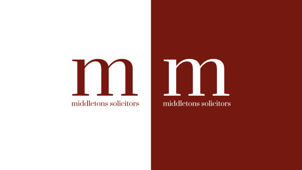
We took a minimalist approach with their new logo, keeping a simple yet elegant and professional design. We used the letter “M” from the design to create a logo type that could be used in various places such as website headers, social media and publications to accompany the larger logo type.
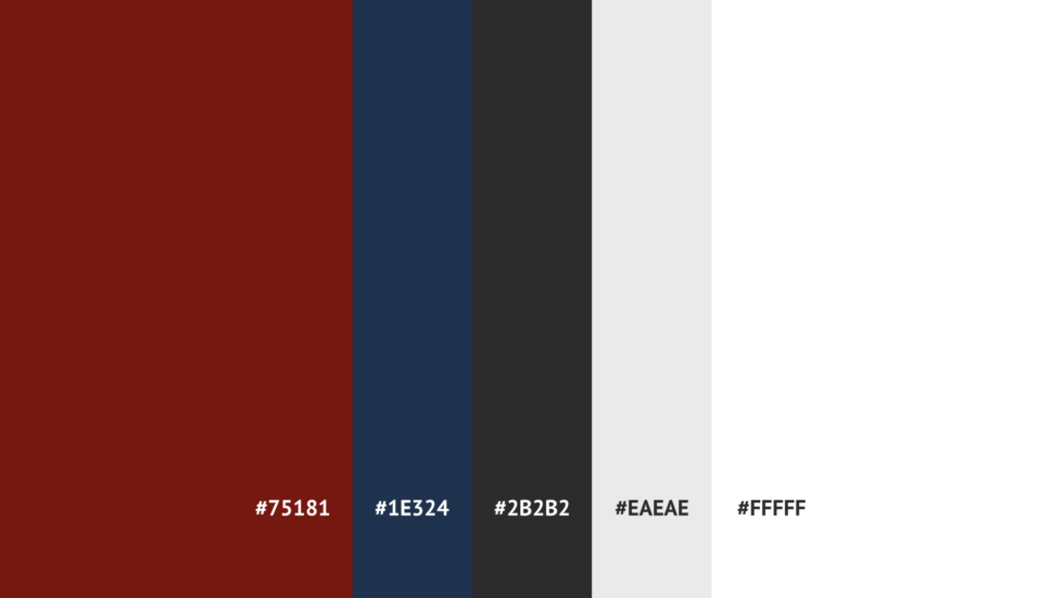
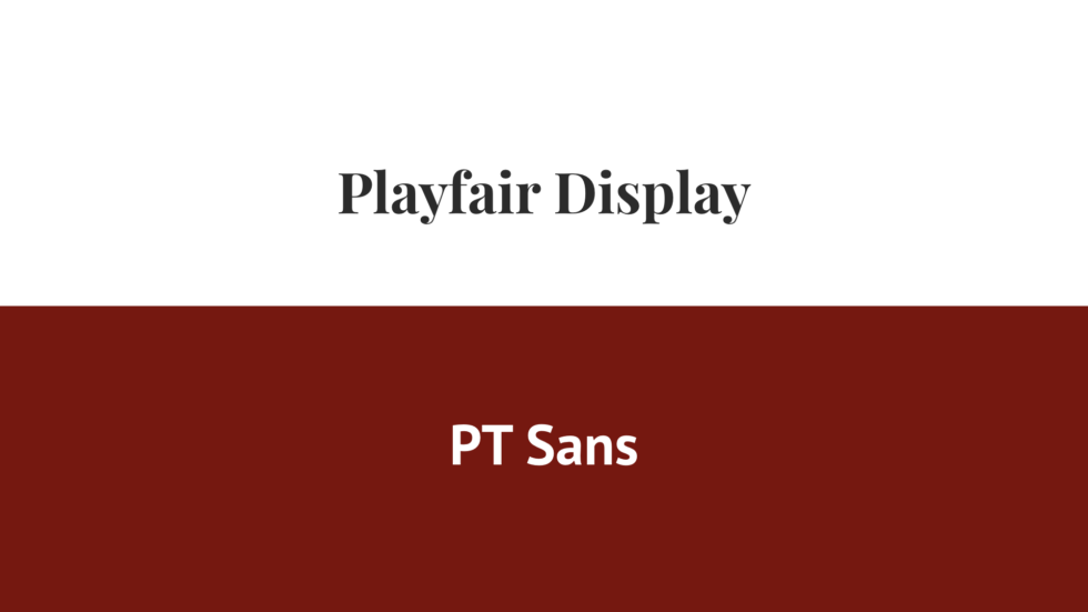
We introduced a new font and colour palette to give it a modern, clean and light aesthetic.
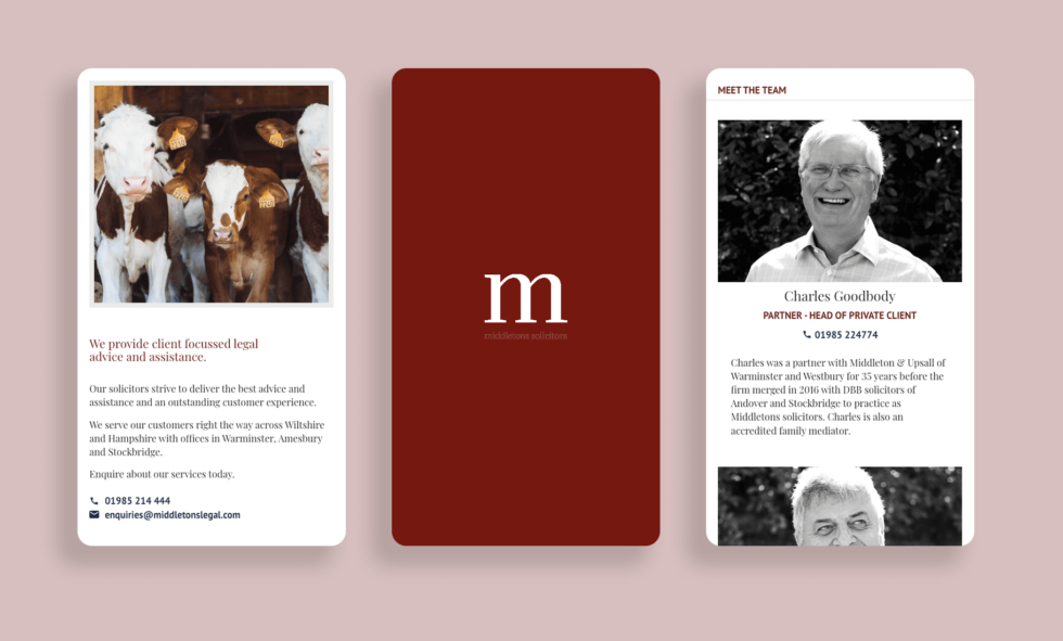
Website design & build
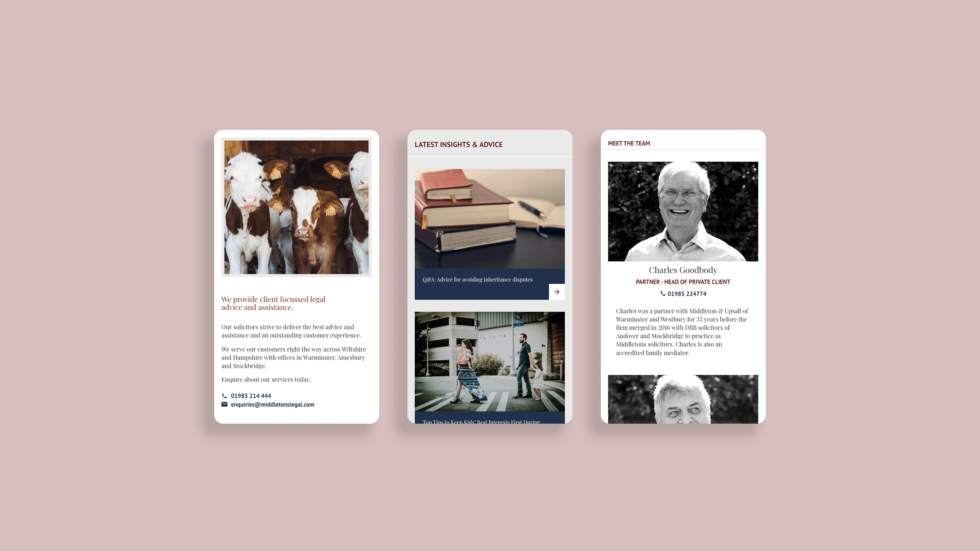
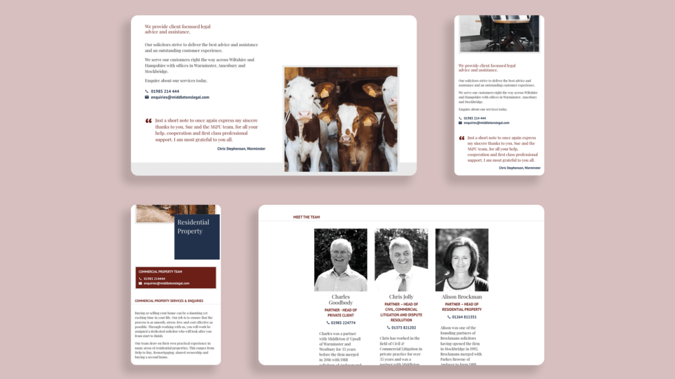
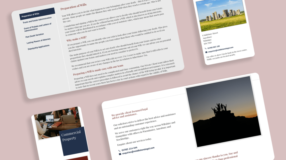
We designed a complete custom website theme and hand built from scratch a WordPress website. We wanted to make sure that the client could easily update their site so we made sure to integrate as much functionality as possible into the theme. This meant that they could easily add new services, and change and add content.
The website is fully optimized for mobile browsing, which means that it will display well on any device, whether it’s a desktop, mobile, or tablet.
The site is also responsive, meaning that it will automatically adapt its layout to fit the screen size of your device without having to zoom in or move elements around manually.
After a quick analysis of their current website, we determined that the site was missing many important elements that would help it rank well in search engines. We then began building a full-page SEO audit with our client to ensure that the website was fast and optimized for search.
Our team reviewed the current site structure, meta descriptions, keyword density, and content on each page of the site.
Results
The website is modern, fast, and optimized. After the launch, we noticed that their bounce rate had dropped by 10% and that there were more people who were visiting their site on mobile devices than ever before. We also saw an increase in page views per visit, which means that people were spending more time on the website after they visited it on their phones or tablets.
We are extremely pleased with our new website, brand and new corporate colour. It refreshes our image and brings us up to date online. We have enjoyed working with Prism over the past few years, they always provide us with useful and helpful advice and we will continue working with them in the future to grow our online business and provide legal information to the community.